Implementing Self-Service Geospatial BI with Tableau Public, Google Fusion Tables, Microsoft Power View and WorldWide Telescope With Excel Add-In
Every now and again, when I want to display the data visually and do so quickly, I wish I had some more sophisticated tools at my disposal. Staple Excel and SSRS functionality is pretty good out of the box, however, particularly when I want my data in a geospatial context with some interactivity built-in, I wish I could quickly and painlessly whip out a simple map to give me a good indication of the status quo. That is where the following three applications may offer some of that functionality: Tableau Public Edition, Google Fusion Tables, Excel with WorldWide Telescope and the new kid on the block Power View add-in for Excel 2013.
In this post I will explore some of the features that they all offer and how to create a quick and simple solution to map the data points in an eye-pleasing manner for exploration and analysis.
First, let’s start with the dataset I will be using throughout this post. HERE or HERE you can find an Excel file which contains Australian post codes with their corresponding Latitude and Longitude coordinates. I have imported the file into my local MS SQL Server instance table and generated some dummy content/narrowed its content to the data applicable to only one state i.e. Victoria (710 records will be sufficient for this presentation), using the following script.
WITH Final_Result
(PostCode, Lat, Long, State, SalesValue, SalesQTY, DivisionNumber)
AS
 (SELECT a.PCode as PostCode, a.Lat, a.Long , a.State,
 CASE
 WHEN a.PCode BETWEEN 3000 and 3100 THEN 10000
 WHEN a.PCode BETWEEN 3101 and 3200 THEN 9000
 WHEN a.PCode BETWEEN 3201 and 3300 THEN 8000
 WHEN a.PCode BETWEEN 3301 and 3400 THEN 7000
 WHEN a.PCode BETWEEN 3401 and 3500 THEN 6000
 WHEN a.PCode BETWEEN 3501 and 3600 THEN 5000
 WHEN a.PCode BETWEEN 3601 and 3700 THEN 4000
 WHEN a.PCode BETWEEN 3701 and 3800 THEN 3000
 WHEN a.PCode BETWEEN 3801 and 3900 THEN 2000
 ELSE 100 END AS 'SalesValue',
 CASE
 WHEN a.PCode BETWEEN 3000 and 3100 THEN 400
 WHEN a.PCode BETWEEN 3101 and 3200 THEN 350
 WHEN a.PCode BETWEEN 3201 and 3300 THEN 300
 WHEN a.PCode BETWEEN 3301 and 3400 THEN 250
 WHEN a.PCode BETWEEN 3401 and 3500 THEN 200
 WHEN a.PCode BETWEEN 3501 and 3600 THEN 150
 WHEN a.PCode BETWEEN 3601 and 3700 THEN 100
 WHEN a.PCode BETWEEN 3701 and 3800 THEN 50
 WHEN a.PCode BETWEEN 3801 and 3900 THEN 10
 ELSE 5 END AS 'SalesQTY',
 CASE
 WHEN a.PCode BETWEEN 3000 and 3100 THEN 'Division 1'
 WHEN a.PCode BETWEEN 3101 and 3200 THEN 'Division 2'
 WHEN a.PCode BETWEEN 3201 and 3300 THEN 'Division 3'
 WHEN a.PCode BETWEEN 3301 and 3400 THEN 'Division 4'
 WHEN a.PCode BETWEEN 3401 and 3500 THEN 'Division 5'
 WHEN a.PCode BETWEEN 3501 and 3600 THEN 'Division 6'
 WHEN a.PCode BETWEEN 3601 and 3700 THEN 'Division 7'
 WHEN a.PCode BETWEEN 3701 and 3800 THEN 'Division 8'
 WHEN a.PCode BETWEEN 3801 and 3900 THEN 'Division 9'
 WHEN a.PCode BETWEEN 3901 and 3999 THEN 'Division 9'
 ELSE 'Unknown' END AS 'DivisionNumber'
 FROM
 (SELECT PCode, Lat, Long, State
 FROM AU_PCodes_and_LatsLongs
 WHERE Lat <> 0 AND Long <> 0 and PCode LIKE '3%'
 GROUP BY PCode, Lat, Long, State) as a)

SELECT *,
 CASE WHEN DivisionNumber LIKE '%1'
 OR DivisionNumber LIKE '%2'
 OR DivisionNumber LIKE '%3'
 OR DivisionNumber LIKE '%4'
 OR DivisionNumber LIKE '%5' THEN 'District A' ELSE 'District B' END AS 'District'
FROM Final_Result
After execution, you should be left with the following output (partial view only).

Make sure you copy the output to Excel (alternatively, Tableau Public recognizes MS Access, text file, OData or Windows Azure Marketplace DataMarket datasources), save it and have your copy of Tableau Public installed on your machine, ready to go. I will be using this Excel file throughout this post with the remaining two applications to keep it consistent.
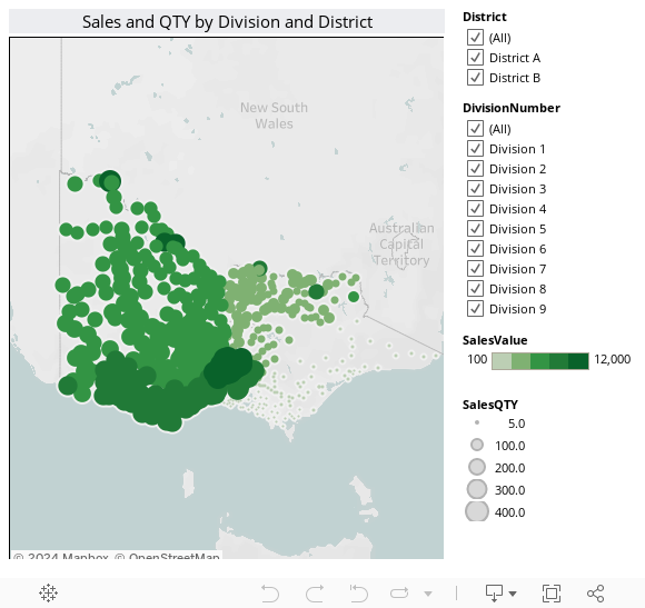
First let’s have some fun with Tableau! Fire up your Tableau Public application and select ‘Microsoft Excel’ from the ‘Connect to Data’ pane on the left hand side (I am using Tableau version 7.0.5 here). Select ‘Single Table’ and the Sheet name you want to import and click on ‘Yes, the first row has field names in it’ from the options provided. Hopefully, this is the screen you will see when the import process finished:

Next, let’s place ‘SalesQTY’ data and ‘SalesValue’ data on the development pane which will automatically get summed up as our measures. Now, onto our dimensions. Let’s click on ‘PostCode’ dimension (should have a little globe symbol next to it). This will bring out the ‘Show Me’ dropdown pane which auto-suggests the best graphical interpretation of the data based on what we imported earlier (if that pane does not appear, just maximize it clicking on the ‘Show Me’ tab in the top right-hand side corner). Next, click on the little map icon – fourth one down in the first row – which will automagically map out our measures’ values based on the post code values we provided in the spreadsheet and generate a map for us. All is left now is a couple of touch ups for increasing the interactivity. Let’s right-click on ‘DivisionNumber’ and ‘District’ dimensions individually and choose ‘Show quick filter’ from the options displayed – this will create our filter which we will be able to use to interact with the map. And that’s pretty much the whole process…we are finished! The whole exercise took no longer than 5 minutes and what we have left as a result is a good interpretation of what the sale quantities and values are in respect to the stores locations. We can also upload the report to Tableau’s public servers if sharing it (read: showing it off) is what you’re after. The exact copy of this report with all its functionality is embedded below (pending Tableau is not doing any maintenance on their servers in which case they will serve a static image with no interactive features enabled).
The next application I want to use to map out the data we created before is WorldWide Telescope (WWT). WWT is a Web 2.0 visualization software environment that enables your computer to function as a virtual telescope—bringing together imagery from the world’s best ground and space-based telescopes for the exploration of the universe. The beauty of WWT from a BI point of view is that through its add-in for Excel, anyone can import and visualize spreadsheet event data with just a few clicks of a mouse. All you need to do is download the desktop client from HERE and the Excel plug-in from HERE (Googling it will probably be just as easy) and using our previously generated data, map out the points on an interactive globe. If that sounds too easy to be true that’s because it really is. First, make sure you installed the WWT Excel add-in. If it’s done correctly, you should see the WWT menu on the top ribbon in Excel as per below.

Open up the previously saved spreadsheet which we generated using the SQL script and highlight the cells which contain the data, including column headings. In case of my spreadsheet (called in Sheet1) that would include the following cells: Sheet1!$A$1:$H$711. Next, under WWT ribbon pane, with the above cell range highlighted, click on ‘Visualise Selection’ button (first one from the left) which will enable layer manger. All we need to do from here is to make a few adjustments. First, assign the values that we want to display to WWT labels in the ‘Map Columns’ tab. You will probably notice that ‘Lats’ and ‘Longs’ columns have been automatically recognized as Latitude and Longitude values. If not, assign ‘Lat’ to ‘Latitude’ and ‘Long’ to ‘Longitude’, map ‘SalesValue’ column to ‘Magnitude’ WWT label and leave everything else as is (default). We will not touch the ‘Layer’ column, however, in the ‘Marker’ column we will do the following: change the ‘Hover Text Column’ to ‘SalesQTY’ value, change the ‘Scale Type’ to ‘Linear’, change the ‘Scale Relative’ to ‘Screen’, change the ‘Scale Factor’ to something low e.g. 0.003 and finally change the ‘Marker Type’ to ‘PushPin’ as per below:

Once all parameters have been adjusted, all there is left to do is to click on ‘View in WWT’ button in the bottom, left-hand side corner in the Layer Manager which, pending you have WWT application running in the background, should display a map (or initially the whole earth) which can be zoomed in on (Shift and plus worked for me) and all data points mapped out accordingly. This map is fully interactive and you can even rotate the globe with a stroke of a mouse, change the layers e.g. from day to night, with or without roads etc. and hover over individual pushpins to display the underlining data they represent (in our case that’s ‘SalesQTY’ as ‘SalesValue’ fields are expressed by the size of the pushpins). Below is a short footage of the finished map based on our Excel data set with the parameters adjusted as per above.
Finally, let’s try to replicate the same functionality with Power View. For this demo I downloaded a preview version of Microsoft’s Office 2013 product. Power View comes standard in the new Excel and due to significant improvement to the geospatial data mapping functionality (if Excel ever had one apart from some third part tools), creating a simple dashboard with our sales and QTY figures in a geospatial context shouldn’t be difficult. First, open up our dataset in Excel 2013, highlight the data including column names and on the ‘Insert‘ tab of the ribbon click on ‘Power View’ icon.
![]()
This will open up Power View development pane where we will work on our map. On the right-hand side, under ‘Power View Fields’ heading let’s untick all the checkboxes under ‘Range’ dataset to clear the development pane of any objects. Now, starting with a clean slate, let’s tick either ‘Lat’ or ‘Long’ checkbox and on the ribbon select the map icon (4th one from the left). This will switch the visualisation for the data region to a map. Next, let’s expand our map and on the right-hand side, under the heading ‘Power View Fields’, drag the columns we want to be mapped, assigning them to the corresponding areas. I chose the following layout for this map.

If you followed through all the steps you should now see our visualisation with all the data points nicely mapped on a colorful bubble-like map. The beauty about Power View is not just the map it allows you to create but also the level of interactivity you can add to slice and dice the data. As a final step let’s add our ‘District’ and ‘DivisionNumber’ fields to the ‘Filters’ pane (just to the left of Power View Fields area). In that way we can interact with the data and change the content based on the filter checkboxes status. Here is a quick video showing some of the interactive features of our newly finished map based on the filters selection.
Last but not least we have another free option for data mapping and spatial analytics – Google Fusion Tables. Just as with other three tools, Fusion Tables is dead easy to use and anyone will be in a position to make a simple maps in a matter of few minutes and collaborate, visualise and share your idea quickly and painlessly. There is already a large number of comprehensive tutorials and forums (including those put out by Google) which outline step-by-step instructions on how to create a feature rich maps so I will not dwell on the specifics here. The process is so simple that all you need to do is have a Google account to access Google Docs, a data source (CSV or TXT will do just fine) and a few minutes to follow some basic tutorials to get up to speed. After you’ve imported the data file, the rest of the process is pretty much wizard-driven and in case of the spreadsheet data we have used all throughout this post (after converting it into CSV format) the final result can be seen below. You also have the ability to click on individual data points (red dots) to get the information allocated to the object.
Given the fact that there is so much more to Google’s Fusion Tables then the image above e.g. Google Maps API, customising and filtering, collaboration sharing and publishing features, embedding into Web applications etc. I have only managed to scratch the surface with this overview paragraph and haven’t really done the justice to its feature-rich functionality but I can already see a huge potential for its capabilities in terms of mapping out geospatial-enabled data and utilising it mainly through the Web interfaces e.g. Intranets, Extranets, websites, blogs, real-time geo-location web services etc.
To recap, I very much like where the new wave of self-service BI tools is heading. In this post I only briefly and superficially explored three products and given the fact that they are all available for free (with limitations and probably not as prime candidates for a fully-blown, corporate solution) it is very exciting to see the BI vendors taking a new approach of solution delivery which is more end user focused rather than purely IT driven. Out of the tools outlined here, I think I am most excited about Power View but let’s quickly step through all of them with their pros and cons and what they can/cannot deliver in the self-service BI arena.
Tableau, particularly in an enterprise environment with large scale deployment, seems to be the ‘duck’s guts’ when it comes to on-the-fly visual analysis and eye candy, however the licensing model and cost can prove to be prohibitive for many businesses. Their unlimited user license for Tableau Server (at the time of writing this post) starts at 160,000 dollars. That is a lot of money and from what I’ve discovered other vendors with similar offer can charge even more e.g. ClickView, Tibco Spotfire etc. Even though the version of Tableau explored here is free and I’ve seen keen IT departments capitalizing on its features and incorporating it into, for example, Intranet sites; the data is hosted remotely and available for anyone to view (privacy issue) plus their cloud service reliability is questionable. Operating from US, I suspect Tableau does their maintenance outside US business hours which for countries in different time zones e.g. Australia falls right on operational times, therefore messages that the service is unavailable are far too common.
Microsoft’s WorldWide Telescope is free but apart from the ‘cool factor’ I would never consider it as a good tool to deliver mapping or geospatial analytics in an production environment unless you want to impress your boss and throw it in to complement, let’s say, PowerPoint presentation. In my opinion, as fancy as it looks, it is more of an exploratory scientific tool rather than an enterprise ready application and sharing the visualisation with the rest of the business is not an option.
As for Google Fusion Tables, it is a fantastic product with great feature set and capabilities, however, it is not a true BI, on-the-fly geospatial analytics tool. It delivers a lot in little time sacrificed to create a nice looking map but to get the most out of its functionality and utilise its API one needs to have a moderate knowledge of web technologies e.g. HTML, JavaScript etc. Knowing your way around spreadsheets and SQL is not sufficient enough, therefore, as capable as it is in an environment which relies on web-enabled reporting and analytical feedback, it cannot be utilized as a BI tool per say, particularly from a self-service, end user point of view.
That leaves us with Microsoft’s Power View which although in its first iteration, will most likely become a great addition to Reporting Services and Excel. It is dead easy to create a visually pleasing dashboard/report, make it interactive and as it comes in Excel – the lovechild of any office department – it is guaranteed to find dedicated user, even if they’re not Excel experts. On top of that, with Microsoft’s plan for future transition to HTML5 (versus the current technology it is based on – SilverLight) and out-of-the-box integration into SharePoint, it hopefully be able to tackle mobile BI delivery, the most desired feature and the next frontier of BI applications deployment.
http://scuttle.org/bookmarks.php/pass?action=addThis entry was posted on Sunday, July 29th, 2012 at 1:13 am and is filed under Visualisation. You can follow any responses to this entry through the RSS 2.0 feed. You can leave a response, or trackback from your own site.


Hello Kind of what I've been looking for - thanks for posting. I don't use Snowflake but gives me an…