How to implement Slowly Changing Dimensions – Part 1. Using default SCD SSIS component to load dimension data
August 21st, 2012 / No Comments » / by admin
This is the first post to the short series (3 more posts) which aims at briefly outlining the concept of slowly changing dimensions (SCD) and how to implement SCD through a variety of methods. In this post (part 1) will endeavour to show and explain the concept of SCD and how to populate a dimension table using the most commonly used method – SQL Server Integration Services and SCD component. SCD component in SSIS has been designed specifically to integrate source and target data in a dimension in such way that the historical values can be preserved and maintained according to three types of tracking commonly available to a designer or developer:
- Type 0 – it manages dimensional changes and an action is performed. Values remain as they were at the time of the dimension record was first inserted. In certain circumstances history is preserved with a Type 0. High order types are employed to guarantee the preservation of history whereas Type 0 provides the least or no control
- Type 1 – it overwrites old with new data, and therefore does not track historical data. Its common uses are for misspelled names
- Type 2 – tracks historical data by creating multiple records for a given natural key in the dimensional tables with separate surrogate keys and/or different version numbers. Unlimited history is preserved for each insert
As this post does not serve as a detailed explanation of the differences and/or similarities between different SCD types other than the basics above, if you are not comfortable with dimensional modelling concepts and want to find out more about SCD methodology, please refer to other sources.
Let’s start with creating some foundations for our SSIS package – tables, constraints etc. which will also be used in subsequent posts to avoid repetition. First, let’s create out data source which will imitate the relational database tables and their content by creating some database objects and populating them with some dummy data as per the script below.
--CREATE RELATIONAL TABLES AND CONSTRAINTS. POPULATE TABLES WITH SOME DUMMY DATA
CREATE TABLE Customer(
CustomerID int IDENTITY (1,1),
First_Name varchar (50) NOT NULL,
Middle_Name varchar (50),
Last_Name varchar (50) NOT NULL,
Email_Address varchar (100) NULL,
Phone_Number varchar (50) NULL,
Created_Date datetime NOT NULL,
Modified_Date datetime NULL,
CONSTRAINT pk_CustID PRIMARY KEY (CustomerID))

CREATE TABLE Address(
AddressID int IDENTITY (1,1) NOT NULL,
Address1 varchar (50) NOT NULL,
Address2 varchar (50) NULL,
City varchar (50) NOT NULL,
Post_Code char (4) NULL,
Is_Current_Flag char(1) NOT NULL,
CONSTRAINT pk_AddressID PRIMARY KEY (AddressID))

CREATE TABLE Customer_Address_Bridge(
CustomerID int NOT NULL,
AddressID int NOT NULL)

GO

INSERT INTO Customer
(First_Name, Middle_Name, Last_Name,Email_Address,Phone_Number,Created_Date,Modified_Date)
SELECT 'Mary', 'Joeanne', 'Black', 'mary0120@yahoo.com.au', '03-8573-9455', '2012-01-01', NULL UNION ALL
SELECT 'John', 'Lorance', 'Moore', 'johnnym@awol.com', '03-3423-1155', '2012-01-01', '2012-05-30' UNION ALL
SELECT 'Martin', NULL, 'Laser', 'mlaser91@aol.com', '03-2355-1109', '2012-01-01', '2012-05-12' UNION ALL
SELECT 'Spencer', 'Chris', 'McEvans', 'spencerdude@hotmail.com', '03-1122-0007', '2012-01-01', '2012-05-30' UNION ALL
SELECT 'Mark', NULL, 'King', 'mk038722@gmail.com', '03-3423-1155', '2012-01-01', '2012-05-30' UNION ALL
SELECT 'Mary', 'Susan', 'Grey', 'mmgrey@gmail.com', '03-1299-3859', '2012-01-01', NULL UNION ALL
SELECT 'Luis', 'Blake', 'Shimaro', 'shimarolou@yahoo.com.au', '03-0385-3999', '2012-01-01', NULL UNION ALL
SELECT 'Natalie', 'G', 'Chin', 'nataliechin@mediasmarts.com.au', '03-3759-1001', '2012-01-01', NULL UNION ALL
SELECT 'Marian', NULL, 'McErin', 'marianmcerin@gmail.com', '03-3400-3331', '2012-01-01', '2012-05-01' UNION ALL
SELECT 'Rick', 'Tony', 'Webster', 'rikky69@gmail.com', '03-9459-1112', '2012-01-01', NULL

INSERT INTO Address
(Address1, Address2, City, Post_Code, Is_Current_Flag)
SELECT '6 Agave Street', 'Apartment 4A', 'Launceston', '7250', 'Y' UNION ALL
SELECT '88 Dodge Street', NULL, 'Sunshine', '3020', 'Y' UNION ALL
SELECT '3 McKenzie Court', 'Level 9', 'Perthville', '2795', 'Y' UNION ALL
SELECT '5 Spencer Drive', 'Unit 9D', 'Melbourne', '3002', 'Y' UNION ALL
SELECT '8 Sunny Avenue', NULL, 'Sydney', '2000', 'Y' UNION ALL
SELECT '83 Mara Drive', NULL, 'Echuca', '3563', 'Y' UNION ALL
SELECT '1038 Mustang Street', NULL, 'Brisbane', '4000', 'Y' UNION ALL
SELECT '1 Bradman Street', NULL, 'Bendigo', '3550', 'Y' UNION ALL
SELECT '12 Cruger Drive', 'Block C', 'Cairns', '4870', 'Y' UNION ALL
SELECT '124 Lasting Court', NULL, 'Adelaide', '5000', 'Y'

INSERT INTO Customer_Address_Bridge
(CustomerID, AddressID)
SELECT 1, 1 UNION ALL
SELECT 2,2 UNION ALL
SELECT 3,3 UNION ALL
SELECT 4,4 UNION ALL
SELECT 5,5 UNION ALL
SELECT 6,6 UNION ALL
SELECT 7,7 UNION ALL
SELECT 8,8 UNION ALL
SELECT 9,9 UNION ALL
SELECT 10, 10

--CREATE CONSTRAINTS
ALTER TABLE Customer_Address_Bridge
ADD FOREIGN KEY (AddressID) REFERENCES Address(AddressID)
ALTER TABLE Customer_Address_Bridge
ADD FOREIGN KEY (CustomerID) REFERENCES Customer(CustomerID)

GO

--CREATE DIMENSION 'DimCustomer' TABLE
CREATE TABLE DimCustomer(
CustomerSK int IDENTITY (1,1) NOT NULL,
CustomerID int NULL,
First_Name varchar (50) NULL,
Last_Name varchar (50) NULL,
Email_Address varchar (100) NULL,
City varchar (50) NULL,
DT_Valid_From datetime NULL,
DT_Valid_To datetime NULL,
Is_Current bit NULL,
CONSTRAINT PK_DimCustomer PRIMARY KEY CLUSTERED (CustomerSK asc))
All we have done here is created 3 tables which will imitate the source of data for our customer dimension, populated them with some made up dummy data and finally created our dimensions table which will act as our target object. If you want you can query the data and when the three source tables are linked you should get the following output for the schema.
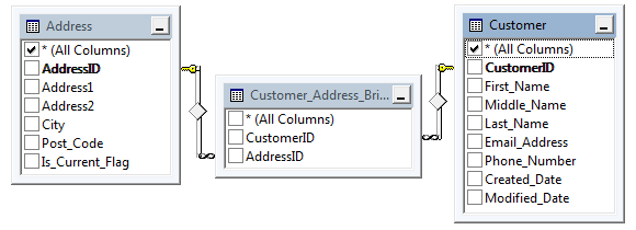
Now, onto the SSIS package. For this post I will be using SQL Server 2012 but these steps should be compatible with version 2008 and 2005. First, let’s create a solution and from the toolbar place a Data Flow Task onto the Control Flow pane. Next, go to Data Flow view and drop an OLE DB Source and Slowly Changing Dimension components onto the pane and link them together so the whole solution looks like the one below.
It is time to adjust some properties and kick off the SCD wizard. First, in OLE DB Source container create a database connection pointing to where we created all the objects as per the script above, from the ‘Data Access Mode’ choose ‘SQL Command’ and type in the following query.
SELECT cu.CustomerID, cu.First_Name,
cu.Last_Name, ad.City,
cu.Email_Address
FROM dbo.Address AS ad INNER JOIN
dbo.Customer_Address_Bridge AS br ON ad.AddressID = br.AddressID INNER JOIN
dbo.Customer AS cu ON br.CustomerID = cu.CustomerID
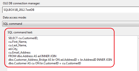
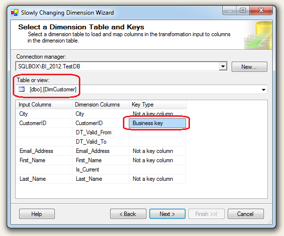
The output from the above SQL code will become our base for populating our ‘DimCustomer’ dimension via SCD. Next, click on ‘Slowly Changing Dimension’ container which will start a wizard driven development. We will use the same connection as per our previous OLE DB query and for ‘Table or View’ property we will select our previously defined ‘DimCustomer’ table. Also, in this section we need to define the unique key business key which will help the wizard and all subsequent loads to differentiate between the new, changed and unchanged data being pumped into our dimension table. For this purpose we will use ‘CustomerID’ column.
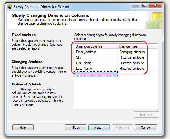
In the next screen we will need to define which attributes will undergo which type of change (if any) if the new/modified version of the data is found in the source tables. For this demo let’s allow ‘City’, ‘Last_Name’ and ‘First_Name’ columns to be of Type 2 SCD (new record will be created if a change is detected) whereas ‘Email_Address’ data will be overwritten with a newer version if a change is found – Type 1 SCD as per below.
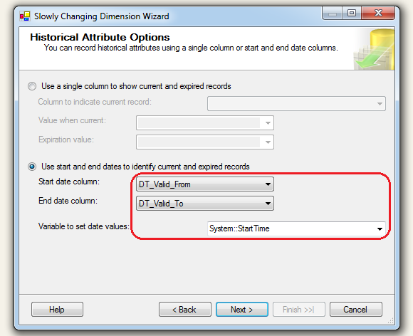
Don’t worry too much for the options in the next screen, click ‘Next’. Finally, in the last lot of proprieties we will need to define if we will use a single field (‘Is_Current’ in this case) or a set of dates (‘DT_Valid_From’ and ‘DT_Valid_To’ in this case) for our changed attributes to track history. Let’s go with dates and select ‘DT_Valid_From’ as a ‘Start Date Column’ and ‘DT_Valid_To’ as an ‘End Date Column’. These columns will be populated as the data in the updated row gets expired to allow for history tracking. We can also select a specific row to act as a flag indicating whether an attribute is valid or no. Another property that needs to be adjusted (providing we select start and end dates to identify expired rows) is ‘Variable to set date values’ field which can use system based variables. For this exercise we will use ‘System: :StartTime’ variable.
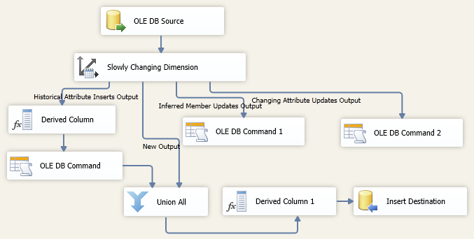
Lastly, specify support for inferred members and choose the columns that the inferred member record contains. When loading measures into a fact table, you can create minimal records for inferred members that do not yet exist. Later, when meaningful data is available, the dimension records can be updated. Go with default options here and click ‘Finish’ to complete the wizard. This will build a bunch of other containers and update the solution with the necessary transformations based on the selections from the wizard. When finished, the solution in the ‘Date Flow’ should look as per below.
Let’s run the solution and see what the output in the destination table is (DimCustomer table).
Now, to understand how changes are applied to this dimension by means of utilising SCD methodology which we have just implemented via the SSIS package let’s commit some updates to our source tables, run the package again and see what comes out at the ‘other end’. First, execute the following UPDATE statements to alter source data.
--UPDATE TABLE Customer
UPDATE Customer
SET First_Name = 'zzzzzzz' WHERE customerid = 4

UPDATE Customer
SET Email_Address = 'zzzzzzz@yyy.com' WHERE CustomerID = 8
Now run the package again and when successfully finished, query the DimCustomer dimension table and identify the changes committed through the SCD components.
What we can observe here is how individual attributes and their corresponding rows underwent an update based on the types of SCD implemented in the package as we went through the wizard options. First thing to notice is how we updated ‘Customer_Email’ attribute. If you recall from the wizard and the options we were facing when determining whether to make this column Type 0, 1 or 2 SCD attribute, we marked it as type 1 i.e. we only wanted its content for the given ‘CustomerID’ updated or overwritten with new values rather than creating another row. Secondly, for ‘First_Name’, ‘Last_Name’ and ‘City’ attributes, when change is detected, we decided that a new record should be created when a change is found. Looking at the UPDATE statements again the first UPDATE referred to Type 2 SCD and second UPDATE to Type 1 SCD. Now, when you examine the output from the DimCustomer table as per image above you will notice that those conditions were met as per our expectations (you can click on the image to enlarge it). Customer with the ‘CustomerID’ of 4 had his first name updated from ‘Spencer’ to ‘zzzzzz’ by means of creating a new record and populating the ‘DT_Valid_To’ datetime field with an expiry date. Also, according to our second UPDATE statement, customer with a ‘CustomerID’ of 8 had her e-mail address updated to ‘zzzzzzz@yyy.com’ but the old e-mail address did not persist and no new record was created as per Type 1 SCD methodology.
As you can see, SSIS SCD component provides an easy and convenient way to populate dimension table without any code or creating complex transformations – it’s all wizard driven and takes literally seconds to implement. One thing that we need to remember though is that this convenience comes with the burden of the lack of flexibility and possible performance issues when dealing with large volumes of data. I haven’t conducted any comprehensive tests which would prove or contradict this theory, however there notion in the industry is to avoid SCD SSIS component when dealing with dimensions which contain numerous records due to the way SSIS processes the data. The Slowly Changing Dimension transformation performs row by row updates to your table, so if you have a dimension table with hundreds of thousands of rows, this could be a very inefficient method. There are other inefficiencies to consider (see HERE) when using this default option as opposed to other alternatives but it is this component’s slow processing that makes it unsuitable for recordsets longer than 1000 rows. With large data volumes it is unacceptable for each incoming row of data to issues a SQL command to check against the reference (or Dimension) table in the database to compare the incoming row against its corresponding row in the reference (you can watch this happening in SQL profiler). This isn’t a problem for small reference tables, but once you start processing thousands of incoming rows against tables with thousands of reference rows, performance starts to drag, because it is doing these row by row checks. The only performance tuning option you have at your disposal is to index the Business Key in the reference table. Luckily, there are other options which I will describe in the next few posts to this series.



Not sure about Polars but I did take ClickHouse (chDB) and DuckDB for a quick test drive - you can…