Which Chart Type For Which Purpose – Infographic
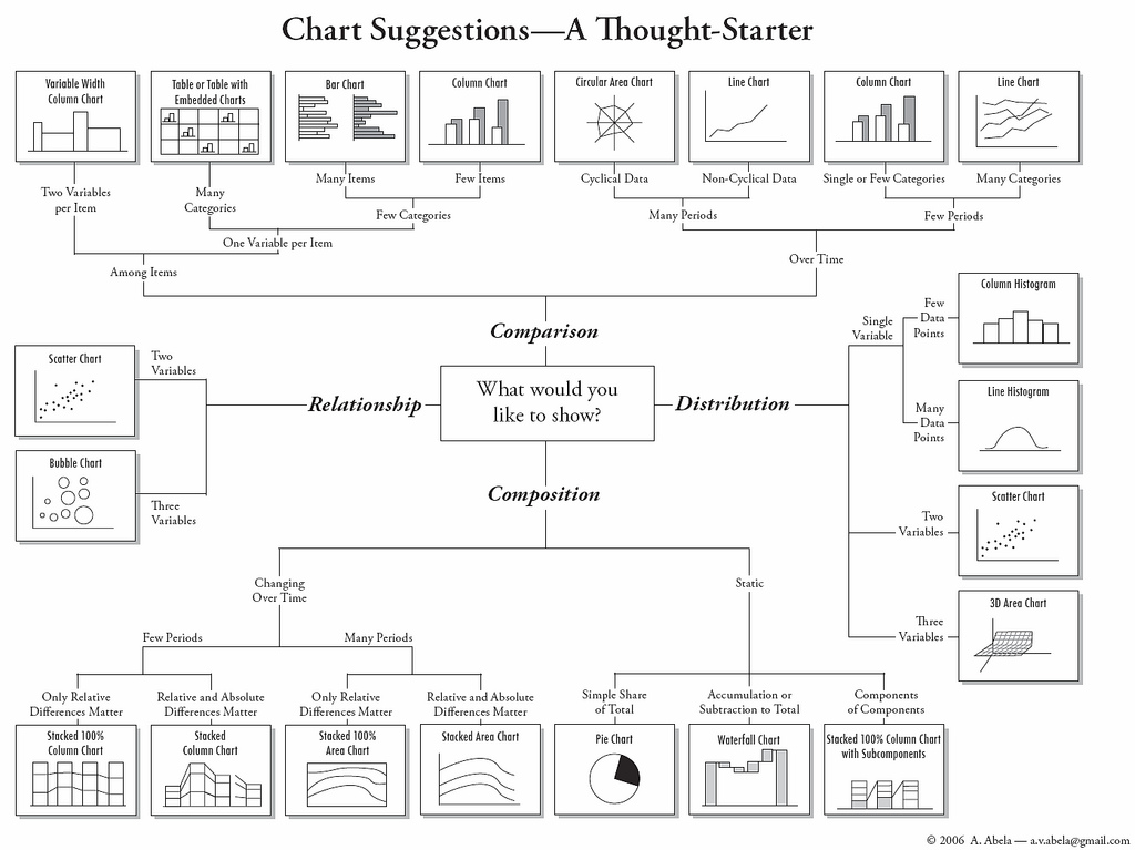
Great data deserves an eye-catching presentation (Check out some of the coolest visualizations on visual.ly), but most charting and graph-making software offers an overwhelming array of options. Andrew at the Extreme Presentation Method blog offers a flowchart to pick the wisest choice. Andrew’s flowchart, shown below as a JPG, starts with the question “What would you like to show?”—comparison, distribution, composition, or relationship—and drills down from there based on how much and what type of data you’ve got to show. Engineers and other Excel wizards probably have this knowledge hard-coded in their mouse fingers, but it’s still a great reference tool for them or anyone looking to show a lot of data and not have it all look the same.
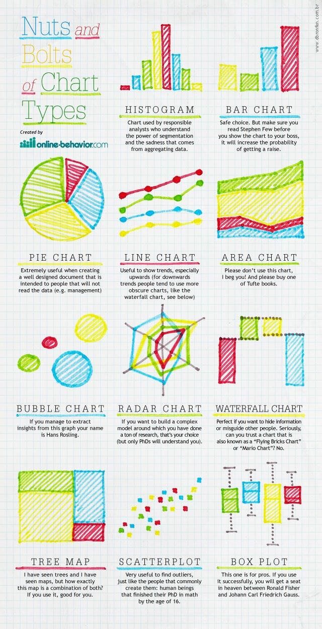
Also, enclosed below, is a comprehensive infographic on which chart types are used for what purpose. The author, Daniel Waisberg from online-behavior.com, does not intend to provide a comprehensive list, neither an accurate explanation of each (you will note!). However, he does provide a ‘tell me which graphs you use and I will tell you who you are’ cheat sheet where he describes some of the personality types of people using different charts.
http://scuttle.org/bookmarks.php/pass?action=add
This entry was posted on Friday, February 17th, 2012 at 4:25 am and is filed under This-and-That. You can follow any responses to this entry through the RSS 2.0 feed. You can leave a response, or trackback from your own site.


Never thought Polybase could be used in this capacity and don't think Microsoft advertised this feature (off-loading DB data as…